Contextual Walkthrough is an integral part of your onboarding engagement marketing strategy. Once the user is on your app, the potential to convert them to customers, cross-sell, upsell, and boost their relationship with the brand – all of these are achievable through well-crafted steps.
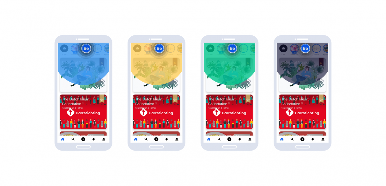
Designing customer onboarding experiences with contextual walkthroughs
“Giving contexts of App through multiple steps”
About the project:
Contextual Walkthrough is an integral part of your onboarding engagement marketing strategy. Once the user is on your app, the potential to convert them to customers, cross-sell, upsell, and boost their relationship with the brand – all of these are achievable through well-crafted steps.
Vision:
Keep users involved and show them their following leading steps!
Design Process:
User story, User flow, Competitive Analysis, Ideate, Visuals and User Testing.
Tools:
Figma, Adobe Illustrator
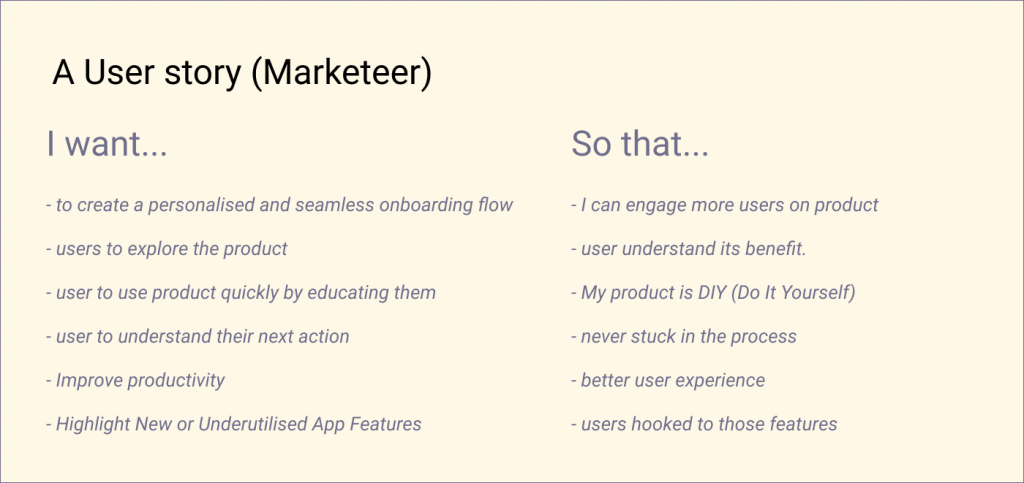
User Story
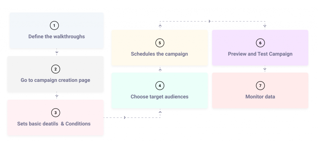
User Flow
Competitive Analysis
We believe a competitive analysis is a plan of action where you actually recognize the competitors and research their products strategies. By doing this, you can create solid design strategies that improve upon your competitor’s. Below are the list which we researched:
- APXOR
- Appcues
- Userpilot
- Tutorialize
- Chameleon
Ideate
Listed down the features required in the product
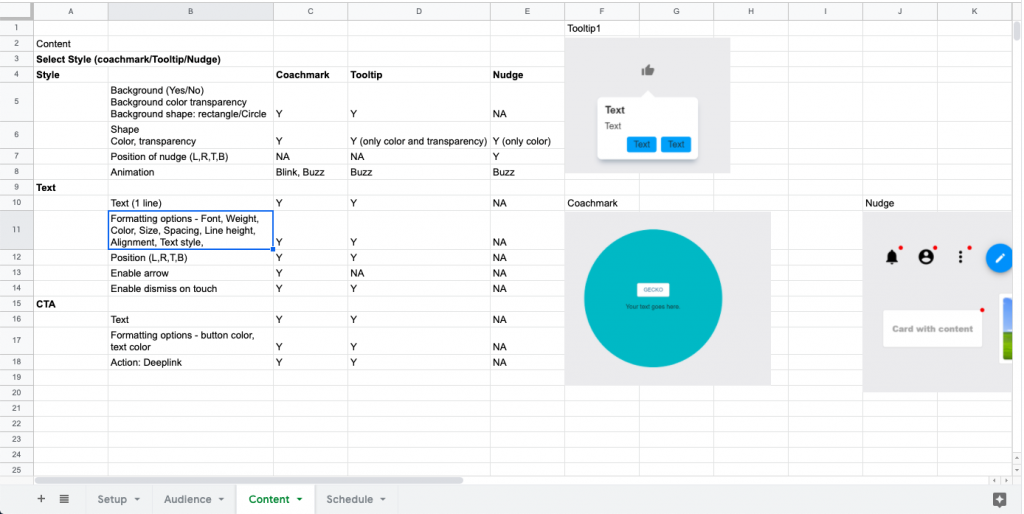
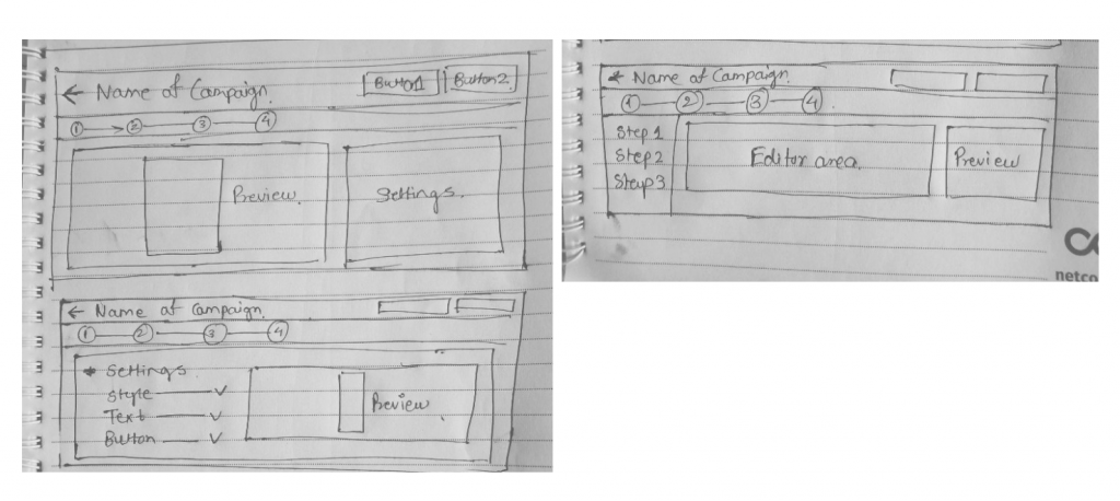
Brainstormed ideas over paper
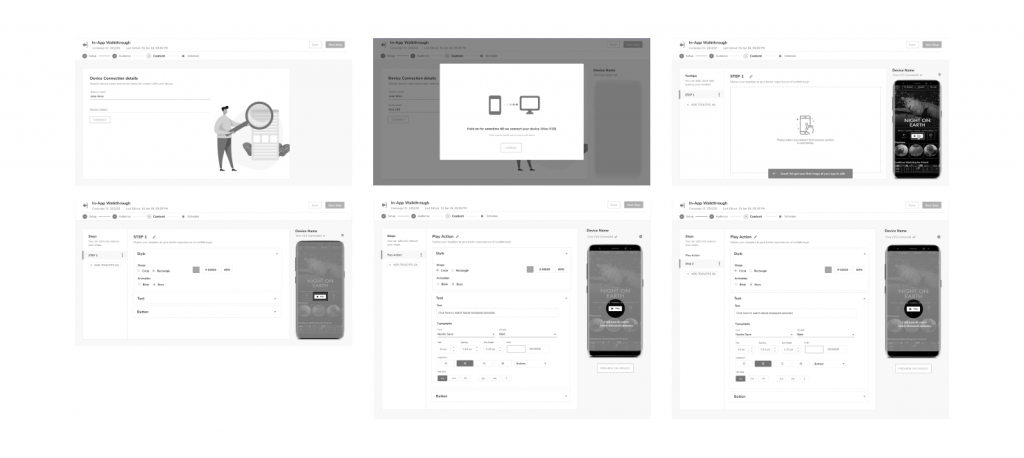
Wireframes
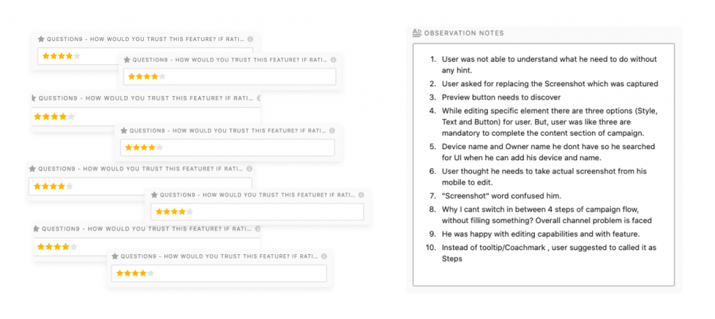
User testing & feedbacks over wireframes
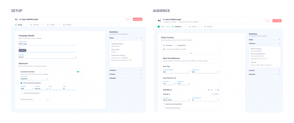
Visual Designs
Finally, we solved all usability flaws and design problems and came up with rich product experience of onboarding with the contextual walkthrough.
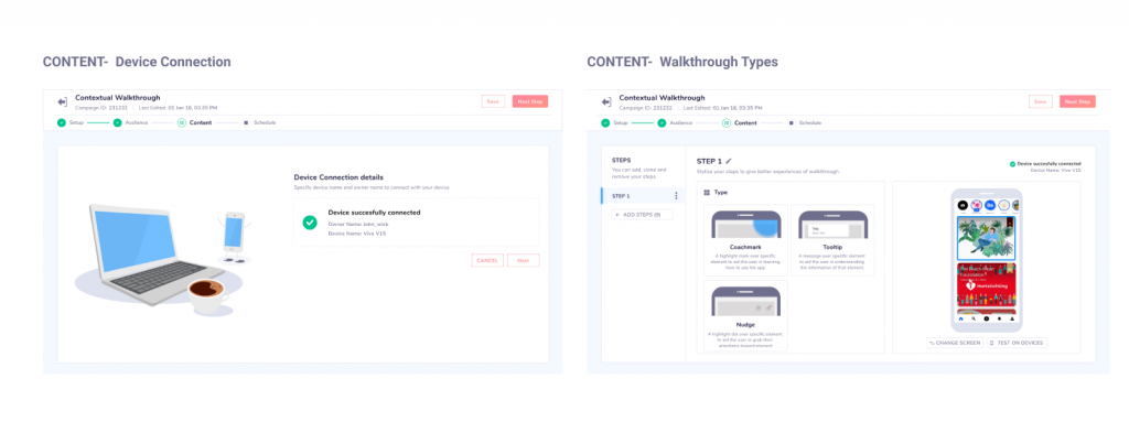
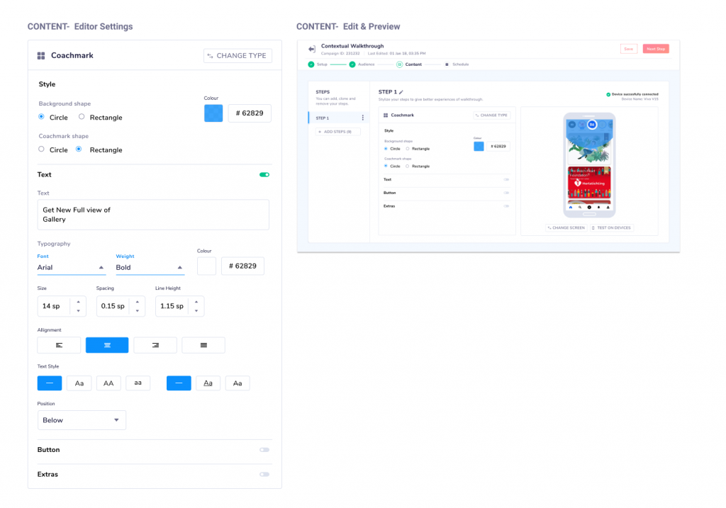
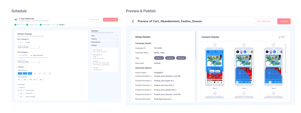
There we go “EASY AND SIMPLE Experience for Contextual Walkthrough! “

Learnings:
- Editor has to be simple yet covering all the use cases.
- Cross-team communication is the key
- Engineering team gave me a lot of exposure towards the technical problem of Web & App, which were solved collaboratively.
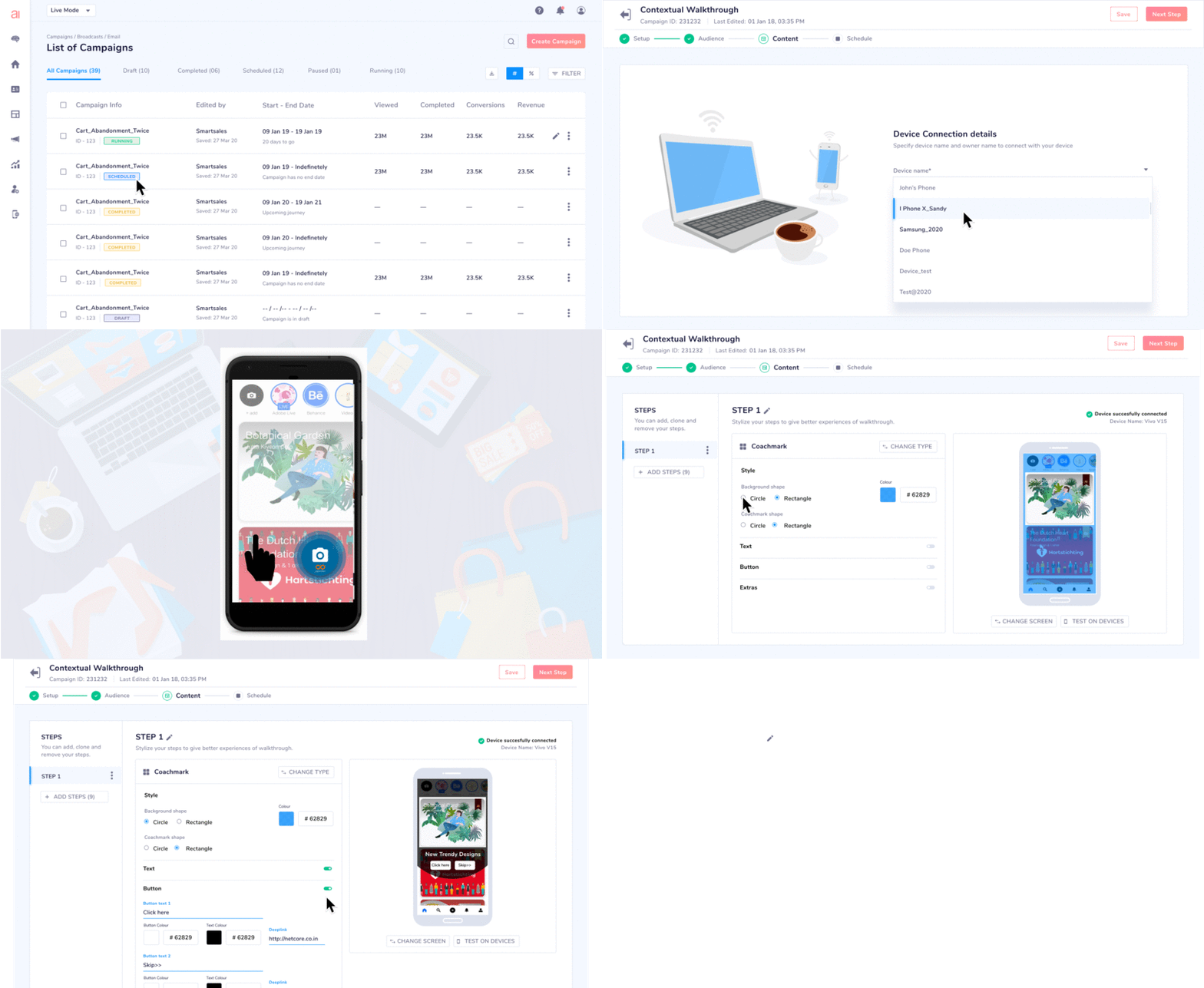
How to make contextual walkthrough?





Leave a Comment