Until and unless you are not designing for machines, an understanding of basic principles of psychology is a must have skillset for every designer.

7 Key Psychology Principles for Product Design
How many of you have actually read a book or done any course in Psychology? I bet a very few of you. Even though we design most of the products for humans to consume but we barely care about understanding the basic principles of psychology applied to product design.
We all talk a lot about tools and methods for designing user experiences but we rarely find any designer talking about how humans are wired to perceive and do certain things in a certain way. If we as a designer understand this wiring in the minds of the human (a.k.a. users) then it increases our chances to understand and shape user behavior for good.
A designer who doesn’t understand human psychology is going to be no more successful than an architect who doesn’t understand physics
Here are some common principles of psychology and how they can be applied while designing digital user experiences.
1. The prevailing empiricism in cognitive psychology
Empiricism is a belief that knowledge comes from experiences. These experiences shape up the mental model of a user. While designing any product it is important that we understand the mental model of the user.
Why is the mental model of a user important?
Mental models create user instincts. Users have a predefined notion of how things work. Any deviation from their self created notion will be a non-intuitive experience for the user. That’s why a designer’s model should comply with the mental model of the user, or at least have a maximum possible overlap.
For the areas where we cannot match the mental model with the designer model, the hack is to have a shallow learning curve for the non-intersecting areas so that it gets quickly and easily embedded superficially in the mental model of the user.
2. Placebo Effect
People experience some benefit when they receive any special treatment or something new which in turn affects their behavior. Physicians often practice this where they tend to give antibiotics even when the common cold or fever is viral. Patients after consuming a medicine feel better even though the medicine might not be related to the ailment.
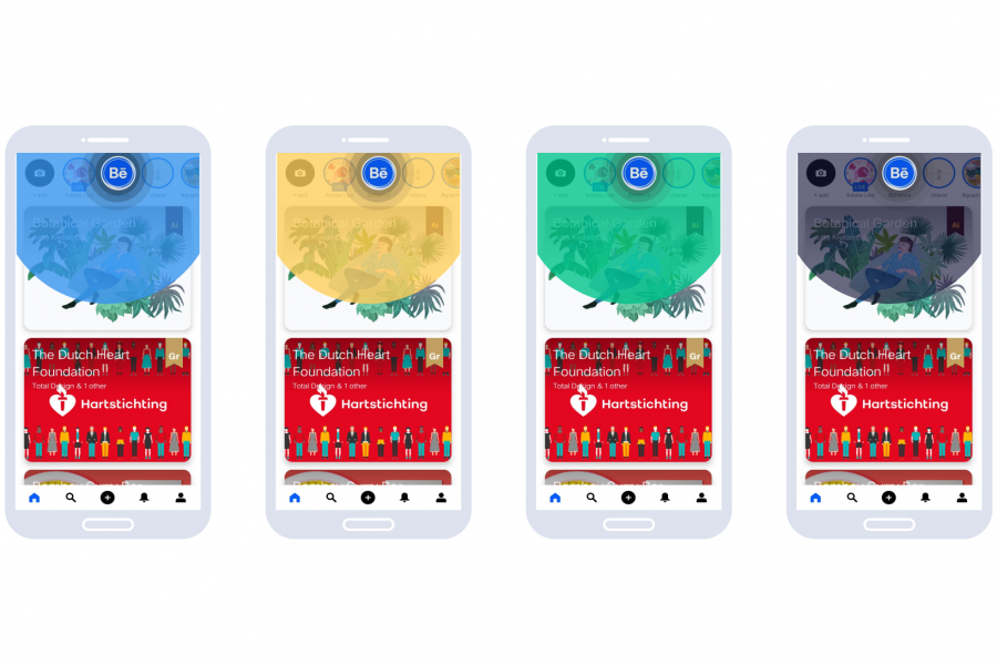
Placebo effect can be applied in digital product experiences by micro interactions and communicative UX writing. For eg., products which communicate that they use AI and ML technologies appeal far better than the ones that do not. Here is an example of how we use micro animations in the icons of our information architecture to give users a delightful user experience.
3. The neurotransmitter ‘Dopamine’
Dopamine is released during task-based interaction, dopamine is instant and lasts for a very short amount of time. A buzzing phone or a social media notification are dopamine fixes and they can be highly addictive. Snapchat, Instagram is all dopamine all the time. If your product experience can give any dopamine rush at any time in the workflow, it makes the user experience a much more delightful one.
It is critically important for products which are trying to change or make user habits. Users love the secretion of Dopamine and if you can delight the users through the user experience they would want to experience it again and again. Here is an example of how Asana ensures that every time a user marks a task as complete they do get a joyful rush.
4. The law of effect
Edward Thorndike suggested that:
The tendency to perform an action is increased if rewarded and weakened if not
Rewards act like reinforcements for a user and can be both positive and negative.
- Positive reinforcement – A user places an order on a site. Everything went smoothly and after the transaction was complete a discount coupon/gift is given to the user.
- Negative reinforcement – A user places an order and the page gets stuck while the payment was processing.
Clearly, positive reinforcements can help to increase repeat and active users for your product whereas 1 single negative reinforcement has the potential to make the user churn.
Designers some time purposely give negative reinforcements to certain actions that they do not want the user to do (a.k.a. Dark UX). A common example of dark UX is designers tend to bury down the logout option in their apps so that users find it very hard to logout and eventually they don’t logout.

5. Cognitive Dissonance Theory
In the field of psychology, cognitive dissonance occurs when a person holds contradictory beliefs, ideas, or values, and is typically experienced as psychological stress when they participate in an action that goes against one or more of them. Cognitive dissonance can occur by:
- Avoiding inconsistent information
- Lack of confirmation bias
- Insufficient justification effect
6. Von Restorff effect
Also known as the isolation effect which predicts that when multiple similar objects are present, the one that differs from the rest is most likely to be remembered! That is the main reason why the primary CTA is given the maximum visual weightage compared to any other CTA on the same page

Another very common example on the pricing page of most of the products:

7. Gestalt’s law
These are probably the most common principles of psychology that most of the designers would have read it at some time or the other. Gestalt psychologists emphasized that organisms perceive entire patterns or configurations, not merely individual components. The view is sometimes summarized using the adage, “the whole is more than the sum of its parts.” Gestalt principles, proximity, similarity, figure-ground, continuity, closure, and connection, determine how humans perceive visuals in connection with different objects and environments.
- Law of Proximity
Objects that are near to each other are often perceived to be grouped together. - Law of Similarity
Objects that look similar are perceived to be grouped together. - Law of Closure
Our mind fills in the blank and makes a complete image so it can still recognize the pattern. - Law of Symmetry
Objects that are symmetrical to each other tend to be perceived as a unified group. - Law of Common Fate
Objects that move at the same speed and/or direction are often perceived to be grouped together. - Law of Continuity
Our mind experiences a visual line of elements that are grouped together. There is a tendency to perceive a line continuing its established direction. - Law of Past Experience
Under some circumstances, objects are categorized according to the past experience of the user.
To sum up, the Gestalt’s law here is a cheat sheet

There are a few other popular principles of psychology that every designer should be aware of:
- Hick’s Law – The time it takes to make a decision increases with the number and complexity of choices.
- Fit’s Law – The time to acquire a target is a function of the distance to and size of the target.
- Aesthetic Usability – Users often perceive aesthetically pleasing design as a design that’s more usable.
- Psychology of colors – Designers should choose the colors that convey meaning so that the right message is delivered.
- Working memory effect – On an average, a human mind can hold 5 +/- 2 pieces of information and anything more than that may be forgotten
User experience design has its root in cognitive and behavioral economics. So a basic knowledge of these principles of psychology would ensure that designers not only create designs that are visually appealing but also functional, usable, and consumable at the same time.


From this article, I learned how to use gestalt principles in Design. Thanks for this article. Check this The Applications of Gestalt’s Principles in UI/UX